Better Tiles for Confluence
A Tile provides an "at a glance" snippet of information that acts as a portal to another page, space, site, document or image.
These responsive areas are arranged in a grid to allow easy navigation as well as being pleasing to the eye.
Installing Better Tiles for Confluence
Log in to the Atlassian Confluence instance as an admin or a system administrator.
Choose → Manage Apps from the menu. The Administration page will display.
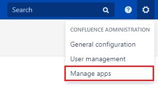
Click the Find new apps link.
Enter the search text "Better Tiles for Confluence" in the search field. The appropriate add-on version appears in the search results.
To install the add-on, click the Buy now or Free trial button.
A confirmation message and details appear when the add-on is installed successfully. Follow the prompts to apply for the appropriate license.
Using Better Tiles for Confluence
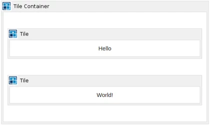
A Tile can only be applied to a page when defined within a Tile Container. Upon installation of Better Tiles for Confluence, two macros will be installed. These are:
Tile Container
Tile
Adding the Tile Container to the page.
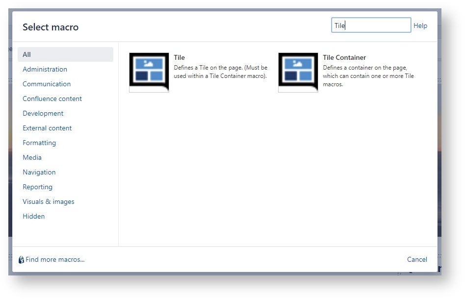
From the editor tool-bar (page must be in Edit mode) select Insert more content > Other macros. Here the user can search and select from the list of installed macros by typing in ‘Tile’.
Select Tile Container.
Complete the configurable properties - described below.
Select Insert to add the Tile Container on the page.
Configuration
Tile Container macro comes with 8 configurable properties:
Direction is used to set the flow of the Tiles. Values are row, column and masonry
Alignment defines how the inner Tiles are aligned in the Tile Container. The values for this field can be:
flex-start - items are placed on the cross-start/top line
flex-end - items are placed on the cross-end/base line
center - items are centred
stretch - stretch to fill the container
flex-start | 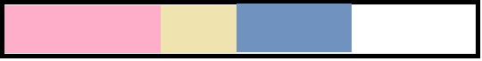 |
|---|---|
flex-end |  |
center | 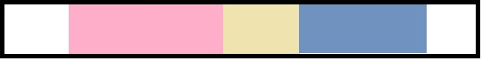 |
stretch | 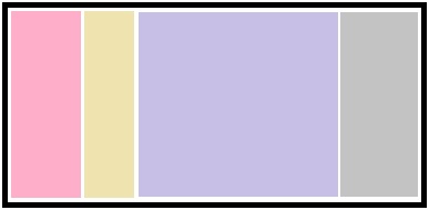 |
Justify defines how the inner Tiles are justified in the Tile Container. The values for this field are:
flex-start
flex-end
center
stretch
space-around
space-between
flex-start | |
|---|---|
flex-end | |
center | |
space-between |  |
space-around |  |
Max Width is used to set the maximum width of the Tile Container. Tiles will fill the Tile Container as long as there is space as per the Max Width. For example

Default Height is used to set the height of all Tiles. If left blank, the default is auto.
Default Width is used to set the width of all Tiles. If left blank, the default is auto.
Gutter is used to set the space between tiles. If left blank it will default to 10px.
CSS Style allows you to configure further styling to the Tile Container.
Adding a Tile to the page.
Ensure your cursor is within the Tile Container on the page.
From the editor tool-bar (page must be in Edit mode) select Insert more content > Other macros. Here the user can search and select from the list of installed macros by typing in ‘Tile’.
Select Tile.
Complete the configurable properties - described below.
Select Insert to add the Tile on the page.
Add your content within the Tile body.
If the Tile is not within the Tile Container previously added, it can be dragged into the correct location.
Repeat these steps to add further Tiles.
Configuration
There are 15 configurable properties in Tile macro:
Height is used to set height of the Tile, and will override the height value of the container. Use auto, percent or a pixel (px) value.
Width is used to set width of the Tile, and will override the width value of the container. Use auto, percent or a pixel (px) value.
Padding sets the content padding
Background Image will fill the container with an image
Background Image Width and Height provides dimensions for the background image.
Background Image Position sets the position of the background image.
Background Image Fill (Checkbox) if checked will set the dimensions of your Tile to the background image.
Background Colour Set colour name, hex, or rgb values. If left blank the default Confluence colours will be used.
URL Link Provide a URL Link and turn your tile into a clickable area.
Text Colour Set colour name, hex, or rgb values. If left blank the default Confluence colours will be used.
Border Colour Set colour name, hex, or rgb values.
Border (Checkbox) Sets a default border and shadow to the tile. Enabled by default.
CSS Style is used to add custom css rules to the selected tile.
ID is used to add a HTML ID to the tile element. Can be used to apply external CSS.
Class is used to add HTML classes to the tile element. Can be used to apply external CSS.
Useful Examples
Use alongside the Include Page macro to insert any Confluence page within a tile!
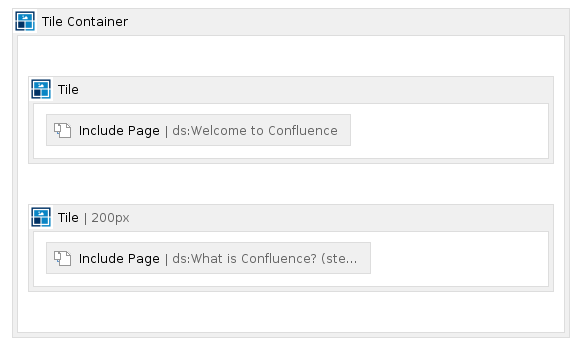
Result